In defence of boring UX
Why users prefer basic design over shiny fluff
The Pale King, the late David Foster Wallace’s final novel, was published in 2011. It’s about IRS employees in Peoria, Illinois
And it’s incredibly boring.
I’m not being cruel — The Pale King contains an intricate description of a traffic jam, a long list of tax forms, and an entire chapter devoted to mundane office tasks. As Michael Pietsch, the book’s editor notes, “David set out to write a novel about some of the hardest subjects in the world — sadness and boredom.”
Defending boring UX is a slightly easier task. I just want to get you excited about the invisible, unsung work required to build useful and understandable digital products that truly satisfy user needs.
Boring defined
Boring user experience is clear and straightforward content, design, and code that solves key pain points. No surprise. No delight. It’s the non-design of IA Writer or the simple poetry of plain language.
Unboring is an error message that requires a PhD to unpack or Microsoft Word’s everything-plus-the-kitchen-sink approach to software.

It might sound strange to advocate for boring UX when our gleaming 1950s jetpack future has finally arrived. But magical ride-sharing apps and charming virtual assistants are exceptions — the basics of digital design are regularly ignored by large companies and tiny non-profits alike. If you’ve ever tried to book a rental car online, connect to hotel WiFi, or use iTunes you know that effective design is still unevenly distributed. Or, as internet-famous writer Paul Ford put it:

To be fair, straightforward digital tasks require specialized knowledge and cross-team collaboration. The design team behind GOV.UK calls this “doing the hard work to make it simple.”
Multiple account login is a very tricky and expensive problem to solve. Visual hierarchy and basic form validation is cheaper and less tricky. When boring design is missing, it usually means someone ignored a checklist, or a stakeholder was bamboozled by a smooth-talking parallax huckster.
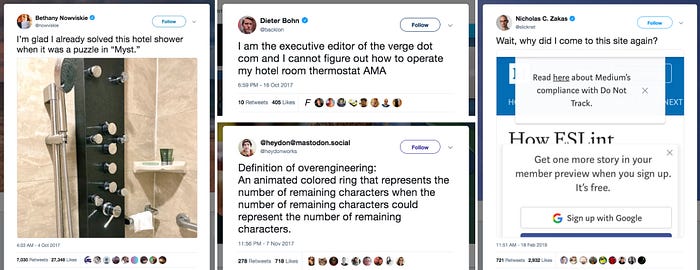
This problem isn’t unique to digital design. Here’s how you get extra hot water from a popular brand of dispenser: Press B twice. When orange light stops flashing press B, then A. Meanwhile, many push doors still have pull handles and most hotel thermostats remain incomprehensible.

If we can’t consistently design for big rectangles, warm air, and hot water after a century of trial-and-error refinement, then we shouldn’t be surprised that human-computer interaction is still imperfect. But don’t despair — boring digital design is within reach of anyone willing to do some thorough, foundational work. While invisible work can sometimes feel taxing or mundane, it’s the raw material for unobtrusive experiences that generate long-term loyalty from grateful users.
And there’s nothing boring about that.
Boring past and present
Design god Dieter Rams, the man who gave the world ultracool Braun radios, is boring. Really. Look at the key adjectives in his 10 design commandments from the late 1970s:
- useful
- understandable
- unobtrusive
- thorough
And don’t forget his final admonition: “as little design as possible.”

Boring design wasn’t born in the 1970s — Minimalism and Brutalism got there first — but it’s the decade it went mainstream. Rams made boring stuff and Robert Venturi et al. theorized about it. In his 1972 book Learning From Las Vegas, Venturi defended “the ugly and ordinary in architecture” and showed readers how to find insight in the commonplace. He took parking lots seriously and believed that the commercial vernacular of Las Vegas — billboards and neon signs — was worthy of critical attention. As he put it, “The iconography and mixed media of roadside commercial architecture will point the way, if we will look.”
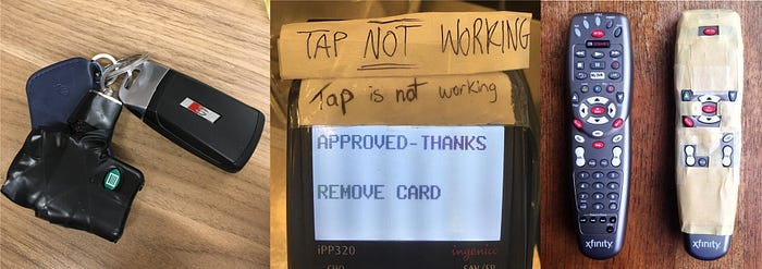
From Venturi you can draw a long, crooked line to IDEO’s Jane Fulton Suri. In 2005, she gave us a name for unvarnished, intuitive, vernacular design: thoughtless acts. Despite — or because of — advances in technology, dozens of thoughtless acts are committed daily:

Many other boring design milestones occurred during the 30 years between Venturi and Suri:
- The rise of private-label products (1981)
- The principle of least astonishment (1984)
- The Psychology of Everyday Things (1988)
- Craigslist (1995)
- Web content accessibility guidelines 1.0 (1999)
- Wikipedia (2001)
- The Hipster PDA (2004)
- Reddit (2005)
- GitHub (2007)
- IA Writer (2010)
Boring UX emerged in 2012 with the launch of GOV.UK, a government site that proved straightforward digital design can improve the lives of millions of people. As the jury who awarded the site Design of the Year 2013 put it, “It may not look particularly exciting or pretty, but that is not the point. This is design in the raw, providing vital services and information in the simplest, most logical way possible.”
While boring design took a decade to emerge, boring UX blew up in 2014. In an August blog post, Intercom’s Paul Adams criticized Dribbble by saying that “Too many designers are designing to impress their peers rather than address real business problems.” Adams argued that “the most important product design is usually the ugliest” and that designers should flood Dribbble with “whiteboard sketches, hand drawings, and back of the napkin problem solving.”

A month later, Cap Watkins praised boring designers who love style guides and “choose obvious over clever every time.” Watkins, a former VP of design at BuzzFeed, also argued that “The boring designer is trusted and valued, because people know they’re in it for the product and the user.”
And, lest we forget, lo-fi social network Ello launched in the spring of 2014. An early example of the brutalist web design movement, Ello was a divisive attempt at creating an ad-free version of Facebook. (It has since shed its boring roots and morphed into Pinstagram.)
Not to be confused with anti-design (which is intentionally ugly and harsh), web brutalism is:
Raw.
Minimal.
Wireframe-y.
Exposed.
Modular.
Practical.
Somber.
Honest.
B&W.
Content-first.
Monospaced.
In other words, omit needless decoration.
As Kate Moran notes in an article about web brutalism, “Digital interfaces are becoming simpler and more streamlined because that’s what users need and want.” The key phrase in that sentence is *becoming simpler.* Because we’re definitely not there yet.
Boring is valuable
In January of 2018 a false missile alert was issued in Hawaii, due in part to a confusing user interface. It took 38 minutes to send out a second message to retract the false alarm. I can guarantee everyone involved wishes that system was a lot more boring.
Boring doesn’t always save lives, but it usually improves them. The titans of the web — Wikipedia, Reddit, Google, Amazon, Dropbox, GitHub — look boring when compared to Snapchat, The Outline, or Bejeweled. But boring companies have millions of repeat users because their products actually work. Over and over and over and over and over.
As Nielsen Norman Group UX Specialist Therese Fessenden argued in 2017, “A product must first, before anything else, satisfy a need and be useful.” That sounds obvious, but the obituary pages of Wired and Fast Company are filled the digital equivalent of chindogu:

“Only when a product is functional, reliable, and usable can users appreciate the delightful, pleasurable, or enjoyable aspects of the experience,” notes Fessenden. In other words, boring underpins delight — and sometimes boring is delightful. Popular apps like Pocket and Instapaper, along with Safari’s reader view, turn exciting into boring by rescuing content from the evil clutches of hyperactive design and indestructible retargeting ads.
In terms of innovation diffusion, I’m an early laggard. I was hectored into installing Ritual by a neighbour who wanted a $5 referral credit. But Ritual works real goodly. How do I know this? Because I’ve watched multiple designers on my team use it without complaint, even though it looks like a Balsamiq wireframe.

Many yawn at the apparent duh-ness of Jakob Nielsen’s 10 usability heuristics for user interface design, first published in April of 1994. But in an industry that suffers from shiny object syndrome, yawn at your own peril.
I understand that it’s tough to get people excited about boring tools and approaches, especially invisible things like semantic HTML, edge cases, and truncation. But without foundational, behind-the-scenes work, products and features can break in terrible ways. Just ask Karen McGrane. She’s an accomplished digital strategist who has spent the past few years warning the UX community that truncation is not a content strategy. But people continue to ignore her, even though she’s written not one, but two great books.
Why? Because solving for truncation is low glory work. To be blunt, it’s a pain in the ass. But Karen is right. And when truncation fails, it can be far more painful:

Boring role models
I’m saddened to say that I didn’t always find boring nifty.
Before moving into copywriting and content strategy, I spent a decade as a freelance journalist. Which meant that for a long time, being clever with words was a key part of my job description. My turning point came in 2015. Here’s an FAQ for Compass, a Vancouver transit card system. Look carefully at the final question on the list: Will my Stored Value ever diminish or expire?

I’m the idiot who wrote the overly clever answer. My sentence doesn’t front-load critical information. It’s not the right tone for public transit. It doesn’t matter that the client asked me to add more personality. I was seduced by the empty rush of exciting.
A few months later my answer was changed to something much better: Your stored value will not expire. And since then I’ve done my best to serve users, not my ego.
My shift from grandiloquent versifier to blunt scribbler didn’t happen overnight and I’ve been helped along the way by many other like-minded souls. A few, like Cap Watkins, self-identify as boring. The rest, like Jared Spool, are simply passionate and tireless about advocating for UX basics. (That isn’t as easy as it sounds. Trust me.)
Here are some of the people who keep me boring:
- Sarah Richards: plain language opens up your content to more people
- Julien Perriere: design with real words
- Steven Garrity: design with difficult data
- Cameron Moll: visual hierarchy still matters
- Xtian Miller: design with big body text
- Ida Aalen: design sites inside out
- Anand Satyan: design without colour
- Josh Clark: the most exciting design systems are boring
- John Saito: delightful design can be dangerous
- Erika Hall: delight is fast and invisible
- Abby Covert: information architecture can solve any mess
- Scott Kubie: don’t get zany with finance and healthcare UI copy
- Kinneret Yifrah: avoid funny microcopy
- Andrea Drugay: copy docs are keen
- Илья Сидоренко: users don’t care about indentations
- Brad Frost: don’t get clever with login forms
- Chris Kiess: ignore the UX bandwagon
- Dan Brown: build products that can’t be abused
- Joel Califa: tiny wins are a big deal
- John Herrman: embrace the shitphone
This list is woefully incomplete. I could easily list a dozen more people in the accessibility community — a group that has cornered the market on saying the same (important) things again and again, in slightly different ways. I’m truly in awe of their brilliance and patience.
Boring for sale
If you think selling ice in the winter is tough, try convincing stakeholders or product managers that invisible work is critical to the success of a project. It’s taken me longer than I’d like to admit to get fluent in boring. Like the accessibility community, I spend a lot of time finding new ways to describe the value prop of content strategy. A few of my current chart-toppers include “language and logic framework” and “systems thinking for content.”
Last year I saw Bob Boiko speak at IA Summit 2018 in Chicago. Bob knows how to talk about invisible. Mockups? He doesn’t care about ’em. Plumbing is his only concern. He believes that the language of the system should drive design and that personas should be built around information needs.
While some might find his approach too hardcore old school, I admire the fact that he’s found the right language to sell structural work. And Boiko isn’t shouting into the wind — Intercom calls this approach “the same language from code to customer.”

Sometimes selling boring is easy — you just need to speak in a business dialect. As Laura Martini argues, “frame your research in terms that are palatable to decision-makers” by using phrases like “move slow to move fast” or disguise research by renaming it “sanity check” or “scalable feedback loop.”
But in many other situations you need to employ a long con. Alison Post, a senior UX researcher I worked with at Shopify, has turned her interview sessions into a team sport. This makes her process collaborative and visible to others, which in turn makes her research more successful.
Unboring temptations
While I don’t think digital design is sufficiently boring, many designers disagree:

As I’ve already acknowledged, being boring all the time can be tough. Even for me. (Mea culpa: Some of my link text isn’t a11y-friendly and this essay isn’t written at a 7th grade reading level.)
What’s critical is knowing when to say no to unboring.
I collect screengrabs of good (and bad) examples of digital design. Whenever I see something that catches my eye, I tuck it away for later. When I revisited those grabs for this essay, I realized that most of my hall of shame examples occurred because someone didn’t trust themselves to be straightforward.
And so, in a moment of weakness, someone at BC Ferries decided to create this piece of Pepe Silvia:

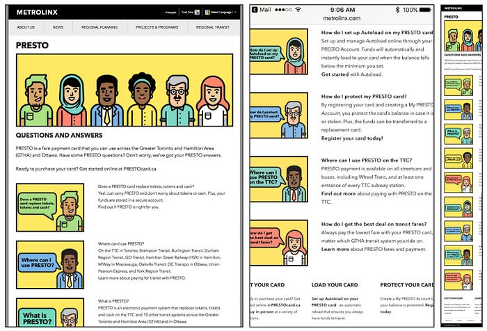
And so, someone at Presto decided to create the world’s first (and possibly only) culturally diverse FAQ — but, in a moment of weakness, forgot to make it responsive:

Now, I want to be super careful here. It’s easy to feel smug when looking at design gone wrong. But last year this tweet lodged itself into my brain:
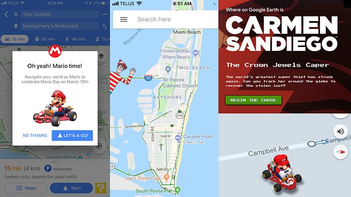
I’m not here to bury bad design. Just to speak what I do know: the bigger a company gets, the more tempting it is to be unboring. Take Google. They used to be a big boring company. But I don’t think they want to be a big boring company anymore. Look at all that cute creeping into the viewport:

But big or small, I beg you, stay boring. Because true delight will always live outside your product. As Chris Kiess notes, “I’ve spent a lot of time in the field on various projects and it is rare I find a user who comments on some aspect of a feature I had discussed ad nauseam with my team.”
Endless debates about indentations, rounded corners, and colour choices are UX’s version of the sunk cost fallacy. Nothing digital design can offer compares to the experiential joy of an Airbnb host in Dublin recommending the perfect nearby bar. Or a Chicago Lyft driver giving you a dozen amazing food and drink suggestions. Or cycling confidently through Portland at 11pm thanks to turn-by-turn instructions on a Pebble watch.
If you’re truly user-centric, admit that the most meaningful life stuff happens beyond the borders of tiny glowing rectangles. UX folks are brokers and intermediaries, not rock stars or ninjas. Your job is to swallow some boredom so people can live better lives.
And if that sounds a bit dreary, remember the words of David Wallace in The Pale King: “If you are immune to boredom, there is literally nothing you cannot accomplish.”
